


 |
||
 Top Nine Worst (US) Dreamcast Cover ArtBy Gregory OborneJune 4th, 2021Posted in Features
To celebrate It’s Still Thinking’s 9-year anniversary let’s have a gander at 9 of the worst US region Dreamcast cover art. Please understand this article is in jest and the critical analysis of design and illustration is by no means an attack on the original artists and designers. I would however like to aim blame on the art directors, and decision-makers of these titles because they DID have their meddling mitts all over these covers and I sympathize with the resulting frustrations. Downward we go!
9. Wetrix+ (2000)Being completely unfair, my mind was made up after seeing the cover when Wetrix+ came out; I will pass. This is one of those cover images that initiates a confused state of thought heavily shrouded in boredom and indifference to solve this mystery. Visually, there is a very unpleasant swampy green spray painted over someone’s science fair diorama and a too-centered main character oddly squeezed between the logo and text; like both elements are trying to burst his bubble. Welp, that explains his worried expression and the warning of an impending FLOOD ZONE. It is puzzling why the art direction settled on a “realistic” visual style over the much more phantasmic graphics found in-game. To be fair now, unlike other entries on this list at least this cover design is complete and composed with complimentary elements and some visual flow.
8. Silver (1999)I can see the appeal of a dark, brooding protagonist; swathed in shadow, pulsing pythons and, whoa wait, a feathery blade? Way to soil the mood Infogrames! Pointy plumes can be cool AND dangerous, but unless I am mistaken the titular hero in Silver, Silver, brandishes weapons of a more, sterner and silvery variety. This may seem like an odd rant, but the European version’s cover is not only incredible; it’s also intelligible, incandescent, and invigorating. Oh and he’s holding swords that are actually meaningful to the game. If I didn’t know better, I would OWN this game based on the European cover alone. Alas, here we are. How about I try and find one thing I like about the US cover at least… It is not the vertical stacked logo type, that’s for sure. Definitely is not that ignited sky, quarter cropped top to bottom just so the logo can be given space. It’s not the odd skin tone that looks like polished mud. Oh wait, I do like the detailing in the armor! And the shiny gauntlets are neat, really sells me on this game being silver.
7. Soul Fighter (1999)Forgive me for being an art snob, I just find this piece a solid shoddy stinker. Let’s start with the old dude mage and male fighter; what’s up with their arms? It looks like they are wearing inflatable muscle suits to cover their destitute feebleness. The old dude mage even looks like he can barely stand; if he were in that good of shape he should have no problem being upright. Back to the male fighter, his sword blade looks completely off in texture and more like Styrofoam, solidifying this cheap-cosplay quality art. The blue-haired female in the center is also over inflated (if you know what I mean) and donning the mandatory “woman fighter” attire of no armor or shielding. She looks like she was just handed these two daggers and doesn’t know what to do with them; although they are rendered quite well with a nice reflective texture. I also must admit I enjoy the saturation of colors for the heroes especially the blues, it does create a unique palette that sets Soul Fighter apart from other games in the genre. A stock asset lava / fiery explosion can be seen in the background which does nothing for the art nor believability of the characters or their plight, but may explain the old dude mages’ windedness. Adorning the top is a fairly decent logo with one too many stroked borders. The welding of the S and R with the curved shape underneath is interesting and I like how it houses the Chinese pictograph. Unfortunately, this cover is another example of the American market getting trash whereas Europe got an exemplary illustration and logo treatment full of soul.
6. Super Magnetic Neo (2000)Arguably one of the most exuberant, vibrantly crafted and kinetic game experiences on the SEGA Dreamcast, Super Magnetic Neo is saccharine goodness for the eyes. This cover instead places us into a white-padded room; sterile, silent and sparse. I do not feel the art is at fault, however, the style for Neo does feel too soft and clashes with the sharp art for the Pinki Gang in the background creating a scrapbook stickering of elements. The drop shadow for Neo and the globe also feels heavy and odd; I think removing that completely and just going all-out white for the background would actually improve this one. It’s also incredibly difficult to read the full title in the logo thanks to a perfect storm of sizing, strokes, drop shadows and adjacent colors. This is a rare cover where each region’s version is pretty bad, with Japan being the best out of the bunch but still peculiar in its extreme simplicity.
5. Resident Evil: Code Veronica (2000)We all would have bought this game even if Steve Burnside were the only thing printed on the front, let’s be honest. While that cover would probably guarantee a few outbursts of violence, the actual cover we got guaranteed no extra sales for non-series fans I REckon. CAPCOM REally took it easy on this one with zero creativity from title logo to character REnders, even managing to obscure the one interesting part of the background. REsident Evil Code Veronica was lauded as the first RE game in the series to showcase fully polygonal graphics thanks to the superior DREamcast hardware so why doesn’t this cover match this momentous milestone? I REmember being so hyped for this game when it launched and being pREtty letdown in the store with this boring placeholder of a cover. Not only is the image of ClaiRE REdfield cropped totally tightly, placed in a very imbalanced location, and shows zero coolness or personality; but the same image can be seen on the back side of the game fuller and with much more pizzazz since we can now see the don’t-mess-with-me posturing and gun wielding of the heroine. Then you have Chris REdfield, looking derpy and confused; perhaps wondering why he couldn’t be shown with a sweet gun or knife. The mundaneness and flaccidity continue with the logo; seemingly typed out text with a generic looking font and a massively large colon.
4. Dino Crisis (2000)Dino Crisis’ cover can easily be interchangeable with Resident Evil Code Veronica’s, it is a tie if you will. Both have unappealing and up-close cropping of protagonists and backgrounds that are just pasted in without relativity for the whole composition. Dino Crisis does have a fine custom logo, one which explains there will be blood during this crisis. Dinos though? There could be some, but from the looks of the steel wall the Wolverine is somehow part of this game. Japan and Europe got what I will call “the foot” cover, which won’t win any awards but is still more interesting than the focus-on-Regina’s-chest version the US got.
3. Dragon Riders: Chronicles of Pern (2000)So this one is purely my opinion on the artwork without any knowledge of this novel series nor game; I forgot it existed until I did research for this ranking list. What drew me away from this illustration was the baby-faced giraffe dragon, giraffgon as it will be referred, and the flooding wash of monotoned red. I am all for limited palettes, but there is no satisfying separation of world and focal point here, just a very flat lying composition and saturation range. The darks are nice and punchy but draw attention to the giraffgon’s trapezoidal wing and the rock formation. With a title like Dragon Riders the last thing I want to feel is grounded, and the emphasis on that rock and the tiny guy standing on it makes me really wish he was riding that giraffgon instead. We have a pretty awesome logo; however, it gets sullied by the heavy-handed outer glow. I do applaud the designer for keeping things simple and it’s neat that the tagline gives a book cover feel it’s just a shame the unridden portly giraffgon is in such a bland illustration.
2. Evolution 2: Far Off Promise (2000)I enjoy irony, and if the designer sat in front of his computer and intentionally zoomed in on this character’s portrait as a joke based on this game’s title then this cover wins for all-time. Just going to assume that is not the case and will scratch my head on why is this portrait illustration of Yulka so close? Not only is it not very impressive nor detailed, but there is a strange murky drop-shadow accentuating it that lifts it from the cover in a bad way. Throw in some floating partially opaque portraits of Mag Launcher and Linear Cannon and we have an uninspired hodgepodge that does nothing for the game. Without a doubt the best thing about the cover is the title logo, unchanged from the first game in the series (which had a much cooler cover) so no real points for that. Indubitably the Japanese cover is top-notch and features an adventure-in-a-nutshell illustration done with exquisite ink lines and animation cell color; easily hooking me in for whatever journey these guys are partaking.
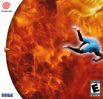
1. ESPN International Track & Field (2000)By far the best example of desolate, derelict design. Either this was given to a design intern or the graphic artist on this project died during the project and deadlines demanded this be printed as-is. We have a quite larger-than-it-needs-to-be logo (I surmise requested by the client) with default settings outer glow and bevel to help bring home this photoshop tutorial into the final stretch. To prove this person knows how to photoshop, they cut out two photographs and placed one awkwardly scaled and positioned, as if the man were running for his life from this cover layout. Finally we have a somber silver background albeit so it looks “finished”. We should always strive for gold; but in this cover’s case, being first is the worst. |
||


© 2012-2022 |
|
|
|
|