


 |
||
 The Best (and Worst) of Dreamcast AdvertisingBy Eric OborneApril 12th, 2015Posted in Features
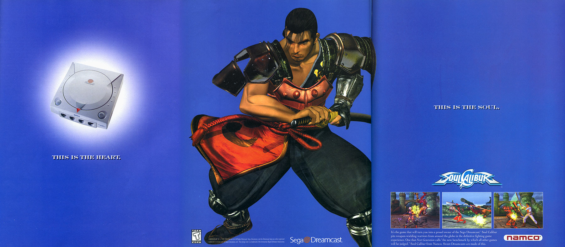
Motivation to buy a particular game can usually be stimulated by seeing video or screenshots, the pedigree of the developer, or by word of mouth. Before the advent of a mostly digital age taking hold, print media was the most opportunistic way for publishers to reach gamers. I always loved (and still do) flipping through page after page and seeing the fun ways that every game used to stand out. It would often reaffirm I wanted to buy a particular game or enticed me to look into one further. Often times this is sending the message subconsciously which may not initially unveil itself but I feel the impact it had during that era cannot be overstated.So without further adieu, let’s look at some of the most notable cases for the US market. The BestSoul Calibur
This may be one of the greatest ads of all time. It’s so poignant and just pure genius. Simple, bold, and smart. As soon as you see it, you get it right away. I love how it’s three pages and builds up, peaks at the middle, then just wraps it all together at the end. The line about it being the game turning you into a proud owner of the Sega Dreamcast speaks to the passion most gamers felt when they first experienced their system. It can be debated which title was more impactful, Soul Calibur or Sonic, for the Dreamcast launch but I feel this nudges it in Soul Calibur’s favor ever so slightly. Blue Stinger
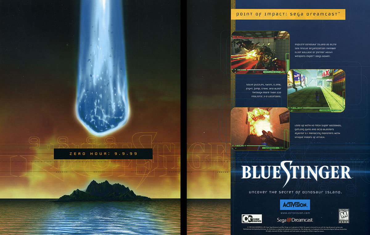
When I first saw this in print, it gave me a lasting impression that I can still fondly look upon now. Overall I think the design is excellent and it’s impressive to create such weight to the pages with only a small amount of graphical elements. The left page is striking, demands your attention, and it cleverly ties in the launch of the game. There is also some mystery to it so it really piques your curiosity. Suffice to say I did not forget to play Blue Stinger in September of 99’. Super Magnetic Neo
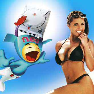
The artwork is beautiful with a nice array of vibrant colors fused with more subdued tones to create a great balance. It just draws your gaze as soon as you flip the page and makes me feel like I’m being drawn into this hypnotic world. There’s a buoyant flow to the layout and a fun tagline that perfectly encapsulates the gameplay and goofy atmosphere. Sword of the Berserk Guts’ Rage
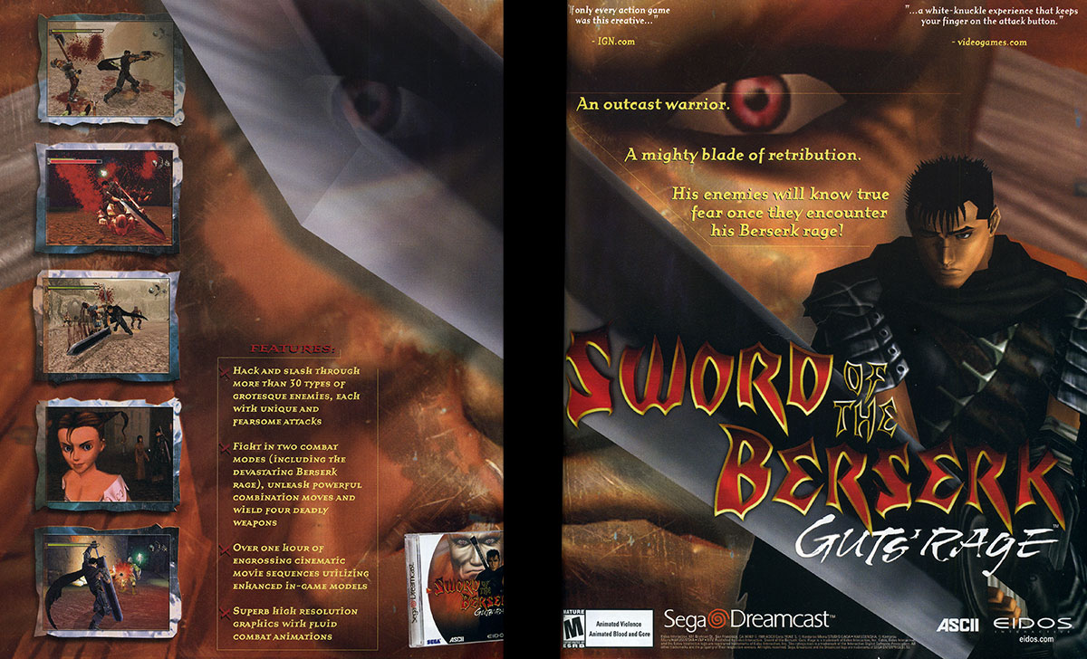
Originally I did not give too much thought to this ad years ago. However, when I was researching for this article I had a newfound appreciation for it. It’s one of the few ads where an in-game model (albeit a touched up high resolution version) still holds up well today. I love how it thrusts Guts’ Dragon Slayer at an angle towards you and you can really feel how monstrous that slab of steel truly is. I think it succeeds in showing how visceral the combat can be with just a few screenshots. NBA 2k1/NFL 2k1
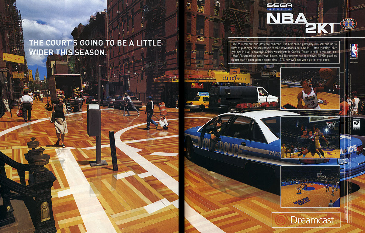
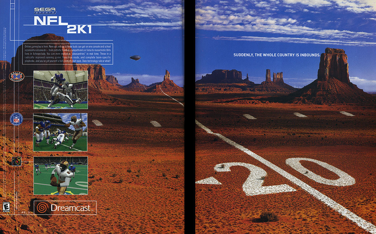
A fine example of a smartly crafted ad that really drives home how big an addition of online play to console sports games was at the time. The NBA 2k1 version has remarkable Photoshop work to convert the streets to a wood floor complete with accurate reflections. I like the rich blue sky in the NFL2K1 ad that thoughtfully utilizes SEGA’s branding color. It’s very effective messaging and clearly highlights the biggest feature of the game(s). The WorstPod Speed Zone
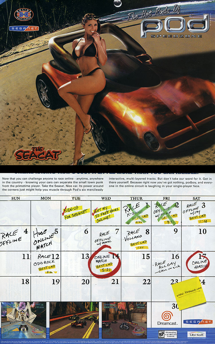
Yeah it’s been said that sex sells but I don’t care how good looking and well-endowed the woman is when that Po(o)d car is so generic and uninspiring that I wouldn’t give this game a second thought. On paper it’s a relatively good concept but it doesn’t work when using this game’s assets. Even the perspective is off since the background has a smaller focal length while the bikini model has a flat perspective. It’s funny that according to the calendar, you are a “small town punk” if you don’t know your cars. Well, I prefer the term fiscally responsible since I didn’t waste my money. Jeremy McGrath Supercross 2000
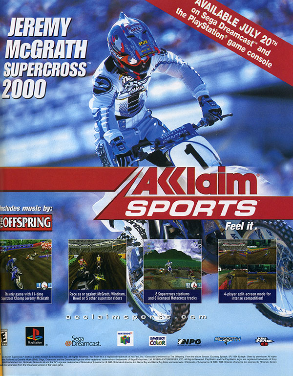
Jeremy McGrath Supercross 2000 is a flawed game. It is considered the worst Dreamcast game according to the Official Dreamcast Magazine. I think the print ad doesn’t mask that fact but Activision should’ve been ashamed to waste a part of a tree on this. It was actually hard for me to find this advertisement when I searched for it which is quite telling of its inconspicuousness. F355 Challenge Passione Rossa
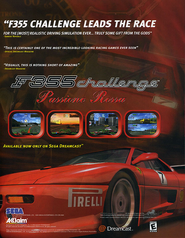
I had to put this in here just because of how lackluster and average it is for such an iconic Yu Suzuki game. It has a straight forward, mundane tagline that leaves little to the imagination. There is also some unusual visual hierarchy where it doesn’t lead your eyes in a natural way. Sometimes I look at the middle first but I also look at the top other times. SEGA seemed to have phoned it in on this piece unless Acclaim was to blame. Carrier
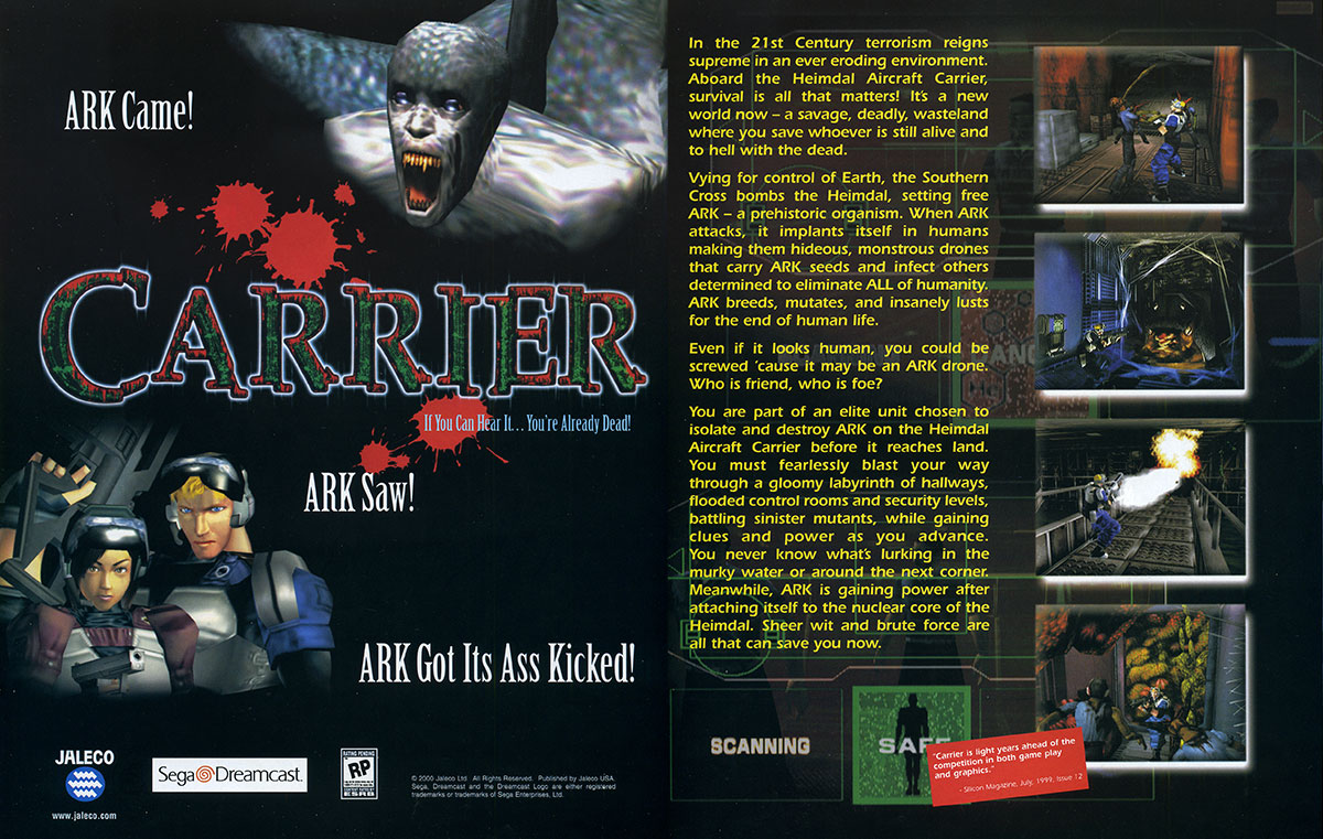
Look away…it’s hideous! Agh the horror! Well I’m sure that’s the reaction they wanted but for all the wrong reasons. I think more care was put into Shenmue’s Yokosuke bystander #15 than this nefarious creature’s model. Not to mention that second page has just way too much text to read. I doubt most people took the time to read all of that and I wouldn’t blame them. I can see why I was never motivated to buy this when it first came out. UFC Championship
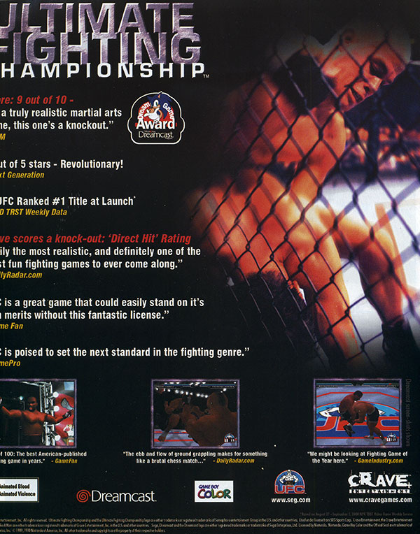
I know what you are thinking: “Eric must’ve really done a bad job with preparing this ad, it’s totally over-cropped.” Well, you can attribute that to there almost being no padding to the left of the page! This is just one of the flaws that show the overall lack of care put into this layout. I remember this game getting great reviews but I would be surprised if this print ad had any positive influence on its sales. I think it’s fun to look at another aspect of a video game other than the game itself. From the advertising, to the game case insert or manual, these are all a part of that game’s makeup and are a multi-faceted representation of the creativity and passion put into (nearly) every product. |
||

© 2012-2022 |
|
|
|
|