 |
||
 Top Nine (US) Dreamcast Cover ArtBy Gregory OborneApril 29th, 2016Posted in Features
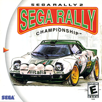
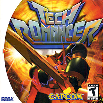
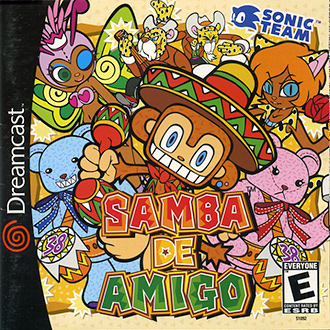
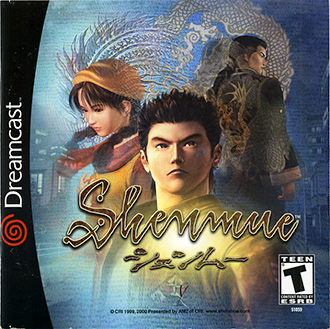
Most of the time our Dreamcast games are busy sandwiched between each other with only their spines showing so we don’t always get to appreciate their full frontal glory. I had to ban any Japanese cover art from this list because the majority of it is just leagues better, but since each region has its own cover style to begin with I think it’s only fair we look at one region’s games. Instead of actually playing any of these games, let’s do what any respectable collector would do and just look at the best US region Dreamcast cover art! 9. SEGA Rally 2 (1999)“Wow, they actually didn’t change the cover for the US?” I remember myself asking when this game came out. For SEGA not to have a polished polygonal or photoshopped photo of a Toyota Celica on the front of SEGA Rally 2 in America made me really happy. What a simple illustration, it’s basically a concept sketch of the Lancia Stratos which is really neat. What would have put this cover over the top would have been if the title logo were drawn as well. It’s too bad SEGA of America changed the colors of the logo otherwise this would have been one of the few cool covers unchanged from a Japanese Dreamcast release. 8. Tech Romancer (2000)This cover is memorable, and when I told Eric about this list I was making it was the first one he brought up so I think it deserves a spot. The layout is divided almost equally between the title logo and G.Kaiser, it’s a simple design but I like that it is easy to digest and puts emphasis on the might of his sword. I especially like how the light behind the sword is parallel with the Dreamcast triangle, almost like it is powering on. I would have preferred having the logo without the bevel and so much gradient but it still manages to be tolerable. 7. Samba de Amigo (2000)This cover is fun, silly, sharp and bright. The game is also fun, silly, sharp and bright. I think that works. Yuji Naka has never had a bad cover to any of his games, it leads me to believe he finds it an important part of completing his work. 6. Shenmue (2000)I like it when a cover uses character models that are better than the ones in the game. In this case, it’s almost like looking at a high production movie poster based on the game from the future. Shenmue’s cover fits to the game so very well, and the logo design and colors present the game beautifully.
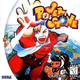
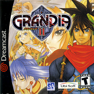
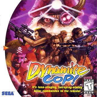
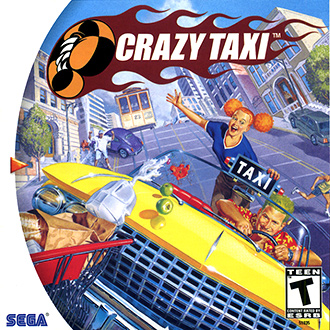
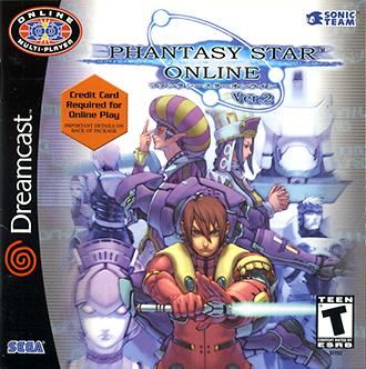
5. Power Stone (1999)Alright, well the US cover crops a large portion of the actual illustration (as seen on the Japanese cover) but it still is able to look like it belongs (unlike the horribly cropped Marvel Vs. CAPCOM US cover). One of the master’s of CAPCOM’s art department (they seriously had a monopoly of talent at one point), Bengus draws with such vividness and wonder you can’t help but want to stare. Having Falcon’s hand behind the P of the title logo creates a very smooth circular road map for the composition. Accented with the Dreamcast’s case dressing and the opposite curving world in the background we have a very appealing and inviting cover. The bright colors and one of the best title logos for any game in history complete this delectable design. 4. Grandia II (2000)There is a very good visual flow to this cover, with each character’s eyes unifying the design and becoming their own focal point you can really soak in the line work. Yushi Kanoe’s designs are stunning and original so getting such an up-close feel to the art is really enjoyable. This is a rare sample where the US cover art actually overshadows its Japanese counterpart (and even is better than the European cover!). For the cherry on top we have the gorgeous Grandia logo. A fitting cover to one of the best games on the Dreamcast. 3. Dynamite Cop! (1999)Much like the time SEGA got Jean “Moebius” Giraud to provide preliminary artwork and ideas for Panzer Dragoon (and ultimately using one piece for the Japanese cover illustration), SEGA wisely repeated this with asking famed comic book creator Tony de Zuniga to provide concept, marketing, and cover art for Dynamite Deka 2 aka Dynamite Cop! Now, this man is a legend. Like Giraud he passed away several years ago but left behind a volume of comic work ranging from Spiderman to Batman, and his own character Jonah Hex. His style is truly unique, done with ink everything looks like it is still wet on the page. The variety of the likenesses for each character give each a believable and life-like quality. The use of magenta and orange as the two prominent colors with everything mixing between the two gives it an exotic, action-movie feeling. It’s too bad the game art didn’t mimic his illustrations closely enough because it would have been extra special. 2. Crazy Taxi (2000)I really really love this cover. The art is so tight and polished and looks like it should be a Children’s book cover in the way it is telling a story. Sure, the perspective is off and the car has a strangely inflated bonnet but just look at the amount of energy! The two characters have a vibrancy and buoyancy similar to a Pete Hawley or Gil Elvgren pin-up model; an exaggerated caricature bursting with expression. The way the milk is spilling out of its container and leading back towards the focal point is very clever and forms a good triangular grouping of elements in the composition. 1. Phantasy Star Online Ver. 2 (2000)This one was easy, I’ve always admired this illustration. The first PSO had a classic cover but Version 2 takes the idea, adjusts the composition, and makes it way more dynamic and intriguing. The layout is zoomed in more giving better detail to the characters, with the HUmar in a much more interesting pose you immediately get a call to action for the game. By having the cast broken up into foreground and background, we’re able to focus in on them individually with higher acuteness. Akikazu Mizuno to this day is one of the best illustrators I’ve seen. His work during this period brought to life worlds and characters that remain as futuristic and cool as they did over 15 years ago. |
||
© 2012-2022 |
|
|
|
|


